
About the Project
Rebuilding a rough concept into a cohesive apparel identity.
RR Wright YPD Identity & T-Shirt Design began as a local circuit apparel project rooted in identity, symbolism, and ministry pride. Before the shirt concepts could be developed, the first challenge was technical: the original logo asset was not production-ready and still contained a Canva watermark.
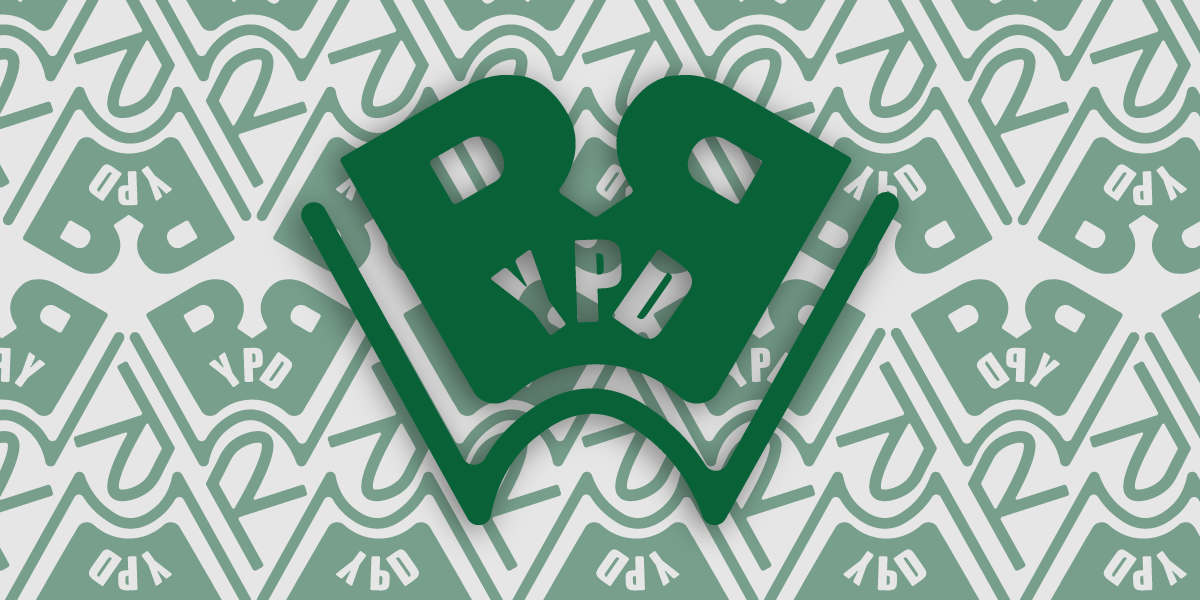
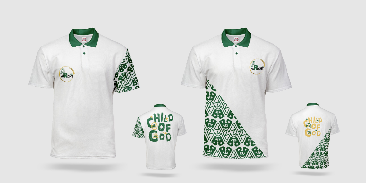
This meant the project first required a clean logo vectorisation and rebuild process. Once the core mark was cleaned up, I developed a stronger supporting visual system through a custom RR Wright YPD monogram, which was then extended into a repeat pattern for use across the apparel concepts.
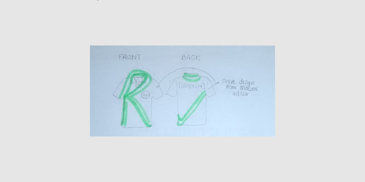
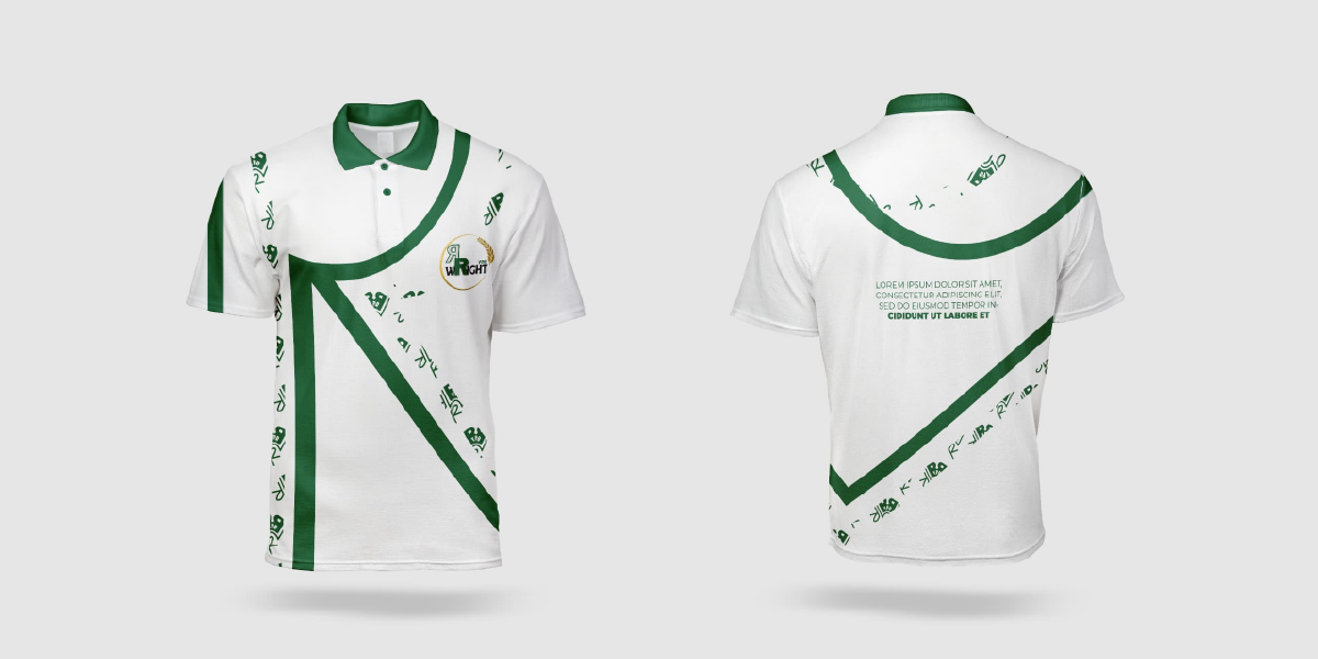
The client also shared a hand-drawn sketch showing their preferred direction for the shirt, especially the use of the two Rs and a tick mark as a visual play on “Wright” / “Right.” I used that sketch as the conceptual foundation, then refined it into a cleaner, more balanced, and more wearable design solution.
One of the main visual decisions was restraint. Although the original direction included a fully patterned sleeve, I simplified the composition to avoid visual overload. Because one of the Rs already carried the monogram pattern, the second R was kept solid green to create contrast, hierarchy, and better production clarity.
The final result balanced logo reconstruction, identity design, apparel application, and visual problem-solving. What started as a rough concept became a more cohesive and production-conscious design system that could function as ministry wear while still feeling recognisable and ownable.
Project Thesis
Apparel identity works best when symbolism, clarity, and production thinking are designed together.